
Revamp design library for 50+ markets internationally
As a design team, we maintained the official online guide for creating digital experiences that look, talk, and act like MetLife. Ensuring international consistency and brand intent.
My contributions
- Rebranded each Responsive Web component.
- Properly documented component profiles with rebranded details.
- Audited most of the icon library and updated to the new standards.
Team
- UX Designer (Myself)
- Team of 4 other UX Designers
- UX Design Manager
- Adobe Experience Manager (AEM) Engineering Teams
- R/GA Design Consultants

We needed our rebrand applied everywhere
Following our design collaboration with RG/A, my team implemented the design system recommendations across all components, styles, and online documentation on design.metlife.com.
Laying the foundations
Helped to redefine our standards, including logo, typography, color palette as well as our core guidance including illustration, icons, photography, and graphics.


Refreshing Responsive Web
I worked with developers and QA to ensure that each Responsive web component was meeting the rebrand’s standards.


Revising the documentation for each component
This included features, variations, documentation, and live HMTL demos for inspection.


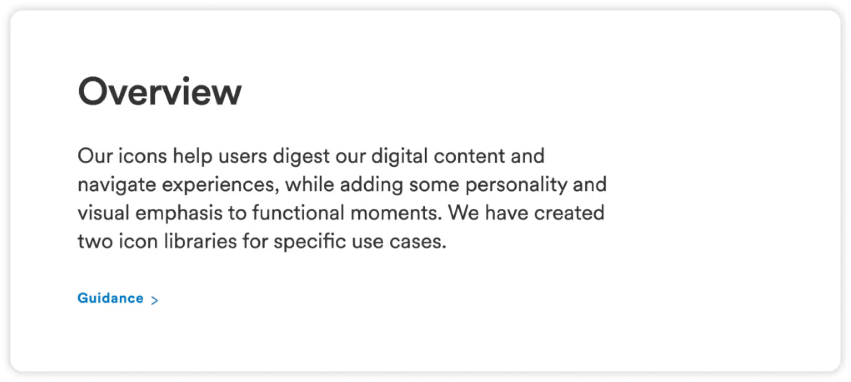
Realigning the icon library
For many, updating the icon library is a rite of passage for becoming a UX designer. For me, it was an important experience that helped me understand atomic design elements and visual communication across a large-scale network.


What I learned during this project
- Cross team collaboration between UX, Engineering, and QA.
- How to conduct Product reviews and work within Agile and Jira to communicate properly.
- How to work within a major design system used by hundreds of employees and contractors.


